Revise

Pie Charts
Pie Charts
A pie chart is a circular chart used to compare the sizes of data sets in relation to one another.
Make sure you are happy with the following topics before continuing.

How to Draw a Pie Chart
Start by drawing a circle with a compass, and then measure the angles with a protractor to make sure we get them right.
To measure the size of each slice, we use the size of the angle that it will take up, out of the total of the circle. To calculate the angle, we use the following formula:
Note: Knowing how to use a compass and protractor will come in handy for other topics and will save time in the exam so make sure you get plenty of practise.

Example 1: Drawing a Pie Chart
Brian asks people what their favourite colour is and separates the answers into categories. His results are shown in the table below. Draw a pie chart to display Brian’s results.
[4 marks]

To draw the pie chart, we need to calculate the size of the angle needed for each category using the formula.
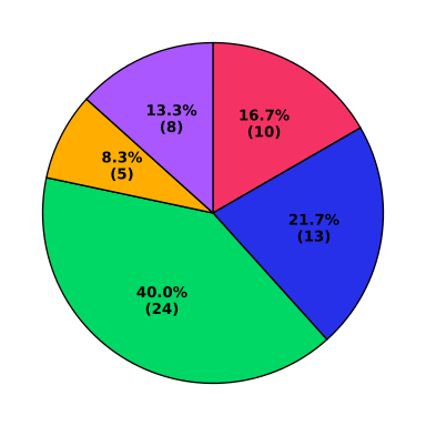
Now we have all the angles, we can draw the chart.
Example 2: Interpreting Pie Charts
A survey was done asking people how many bathrooms were in their home. Freddie drew a pie chart to display the results of this survey.
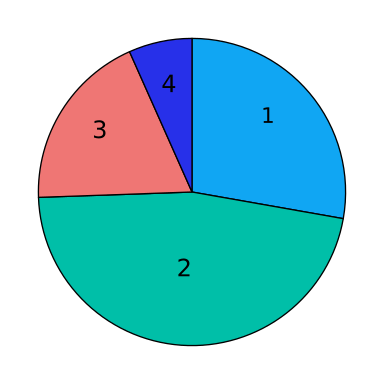
a) What number of bathrooms was most common in this survey?
[1 mark]
b) Calculate the number of people who have bathroom in their house.
[2 marks]
c) If Freddie picks someone at random from the group surveyed, what is the probability that he chooses a person with exactly bathroom in their home?
[2 marks]
a) Clearly, ‘ bathrooms’ has the biggest slice, so the most common number of bathrooms is .
b) To work out how many people had exactly bathroom in their house, we will have to use a protractor to measure the size of the angle in the ‘ bathroom’ slice.
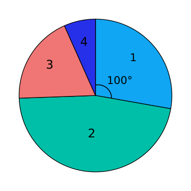
We can see that the angle for this sector is . Using the pie chart formula,
Subbing in the numbers we get,
Number of people with bathroom
c) To find the probability of randomly picking someone with bathroom, we just find the proportion of people with bathroom as a fraction of the total. Doing this, we get
probability of picking someone with bathroom
Pie Charts Example Questions
Question 1: The pie chart shows the colours of the jumpers that students wore to school for a non-uniform day. How many students wore a red jumper?

[2 marks]
From the pie chart, we can see that the slice representing red jumpers is a right angle which tells us that this slice is exactly one quarter of the circle.
Therefore, one quarter of the class wore a red jumper on this non-uniform day:


Question 2: John recorded the grades his class received on a piece of homework in the table shown below:

Draw a pie chart to represent John’s data.
[3 marks]
We have to work out the size of the angle that each grade ‘slice’ should have. We know that John recorded the grades of 24 pieces of homework .If of the pieces of homework were awarded a grade A, we can write this as a fraction : or .
Therefore of the pie will be the slice for grade A so one quarter of the whole pie chart will be a slice with a right-angle since,
Homework that was awarded a grade B can be expressed as the following fraction:. Since we know that there are in a circle, then the angle for the grade B slice must be of :
The angle for the grade C slice must be of :
The angle for the grade D slice must be of :
Drawing the circle with a compass, and measuring the angles with a protractor, we should have a pie chart like the one shown below:

Question 3: The below pie chart shows the colours of cars that passed underneath a bridge during a one-hour period. A total of cars passed beneath the bridge. The number of yellow cars is represented by an angle of degrees. How many yellow cars passed under the bridge?

[2 marks]
We know that cars passed underneath the bridge and that the number of yellow cars is represented by a slice of degrees.
We know that in a circle there is a total of , thus the proportion of yellow cars can be expressed as the following fraction:
If of the total number of cars were yellow, then the number of yellow cars can be calculated as follows:
Question 4: The pie chart shows different makes of cars in an airport car park.

There are Kia cars, which is represented by an angle of .
a) How many Renault cars are there if they are represented by an angle of ?
[2 marks]
b) How many cars are there in total in the airport car park?
[2 marks]
a) We first need to calculate how many cars are represented by .
We know that Kia cars is so we can work out what is:
Then if Renault is we can find this from our value for .
So there were Renault cars in the car park.
b) Similarly to part a, we can find the total by multiplying our value for by instead of .
Question 5: Oliver and Lewis spend their leisure time by pursuing various sports such as golf, tennis and climbing. Oliver has hours of leisure time per week, the breakdown of this time is shown in the pie chart below, where the angle of the slice representing golf is degrees.

Lewis has hours of leisure time per week, and the breakdown of his leisure pursuits is shown in the below pie chart:

If Lewis spends the same amount of time as Oliver each week playing golf, then how many degrees should the slice representing golf be?
[3 marks]
The first thing we need to work out in this question is the amount of time that Oliver spends playing golf.
We are told that he has hours of leisure time in total and that this is represented by a slice of the pie chart. Since we know that there are in a circle, then the proportion of the time that Oliver spends playing golf can be expressed as follows:
We can therefore calculate the amount of time he playing golf as follows:
If Lewis spends hours of the available playing golf, this will be represented by of the pie chart. Since the pie chart is a full circle , then the slice of the pie chart can be calculated as follows:
Specification Points Covered
2. interpret and construct tables, charts and diagrams, including frequency tables, bar charts, pie charts and pictograms for categorical data, vertical line charts for ungrouped discrete numerical data, tables and line graphs for time series data and know their appropriate use
Pie Charts Worksheet and Example Questions

(NEW) Pie Charts Exam Style Questions - MME
Level 4-5GCSENewOfficial MME